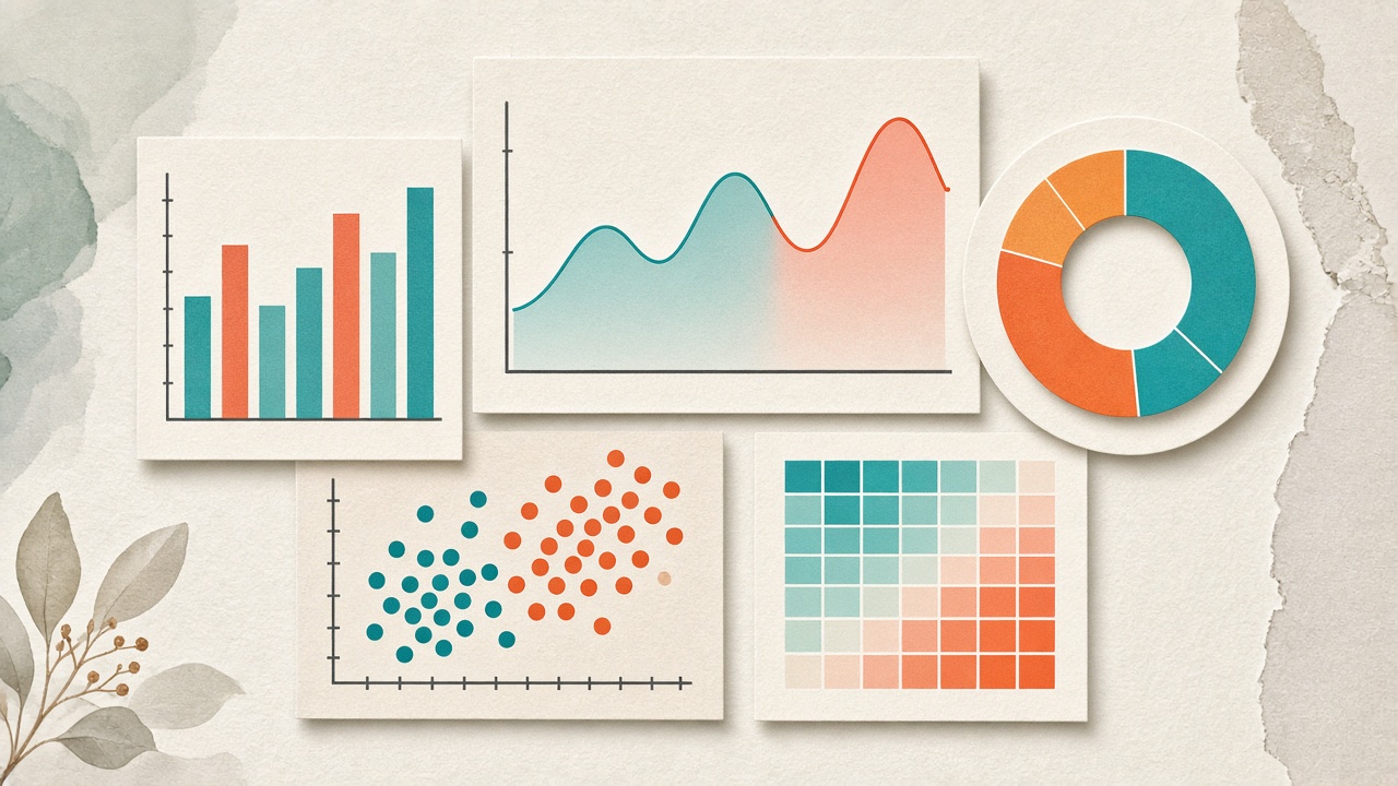
Opening a charting tool and seeing thirty chart types can feel like standing in front of a wall of paint swatches. The options are exciting — and easy to misuse. A beautiful pie chart of monthly revenue trends will hide the story a line chart would reveal in seconds. A scatter plot of regional sales will bury the ranking a bar chart makes obvious.
The fix is not more chart types. It is a clearer decision process: start with the question, then pick the form that answers it.
Start With the Question, Not the Chart
Before you drag a field onto an axis, write one sentence: “I want my audience to see ___.” That blank usually falls into one of five intents:
- Compare — Which category is larger? Which region leads?
- Show change over time — Is the metric rising, falling, or seasonal?
- Show composition — How do parts add up to a whole?
- Show relationship — Do two variables move together?
- Show distribution or density — Where do values cluster, and where are the outliers?
Rule of thumb: If you cannot finish that one-sentence intent, you are not ready to choose a chart — you are still exploring the data.
The Core Chart Menu (And When to Use Each)
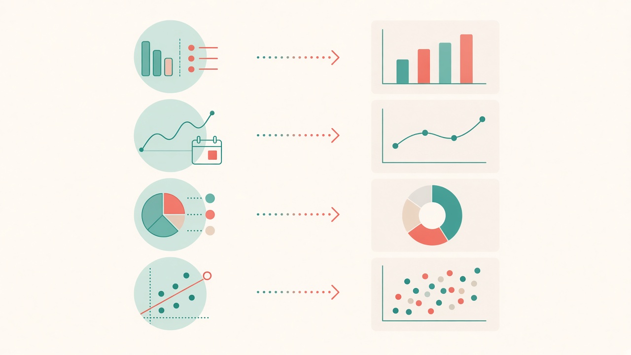
Bar & Column Charts — Compare Categories
Bars are the workhorse of business visualization. Use them when you have discrete categories and a single measurable value: revenue by product, tickets by team, conversion by campaign. Horizontal bars shine when labels are long; vertical columns work well for short category names or ordered time buckets.
Avoid when: you have dozens of categories with tiny differences — consider a ranked list or a filtered top-N view instead.
Line & Area Charts — Reveal Trends
Lines excel at continuous time series. They make slope, seasonality, and inflection points readable at a glance. Area fills can emphasize magnitude, but use them sparingly: stacked areas become hard to read beyond a few series.
Avoid when: categories are unordered (e.g., product names). Connecting unordered points implies a sequence that does not exist.
Pie & Donut Charts — Show Parts of a Whole
Pies and donuts work for a small number of segments (ideally 2–5) that sum to 100%. They are excellent for a single share-of-total moment — market share, budget allocation, survey response mix.
Avoid when: you need precise comparison across many slices, or when values change over time. Use a bar chart or a stacked bar over time instead.
Scatter Plots — Expose Relationships
Scatter plots put two numeric variables on the axes and let patterns emerge: correlation, clusters, and outliers. Add size or color as a third dimension only when it clarifies, not decorates.
Avoid when: one axis is categorical. That is usually a bar chart in disguise.
Heatmaps & Treemaps — Density and Hierarchy
Heatmaps reveal intensity across two dimensions (hour × day, feature × cohort). Treemaps show hierarchical composition when nested categories matter more than exact values.
Avoid when: your audience needs exact numbers more than pattern — pair with a table, or switch to bars.
Quick Decision Table
| Your intent | Best default | Strong alternative |
|---|---|---|
| Compare categories | Bar / column | Ranked list, lollipop |
| Trend over time | Line | Area (few series) |
| Parts of a whole | Donut / pie (≤5) | Stacked bar |
| Relationship of two metrics | Scatter | Bubble (add size) |
| Density / intensity | Heatmap | Histogram |
| Hierarchical composition | Treemap | Sunburst |
Five Mistakes That Kill Clarity
- Decorating instead of communicating. 3D effects, heavy gradients, and unnecessary dual axes make charts look “designed” while making values harder to read.
- Too many series on one canvas. If a legend needs more than five colors, split the view or highlight one series and mute the rest.
- Misleading scales. Truncated Y-axes exaggerate small differences. Start at zero for bar charts unless you have a clear reason not to.
- Pie charts with too many slices. Beyond five segments, the eye cannot compare angles reliably — switch to bars.
- Charting before cleaning. Missing values, mixed units, and unsorted categories produce confident-looking nonsense. Clean first, then visualize.
From One Chart to a Dashboard
A dashboard is not a collage of every chart you can make. It is a short narrative: overview → drivers → detail. A practical layout:
- Top: 3–4 KPI numbers with sparklines for context
- Middle: one primary trend or comparison that answers the main question
- Bottom: supporting breakdowns (by region, product, segment)
Keep interaction purposeful — filters and drill-downs should answer follow-up questions, not invent new ones.
Practice Beats Theory
The fastest way to develop chart judgment is iteration: import a real dataset, try two or three chart types for the same question, and keep the one that a colleague understands in under five seconds. Tools with a broad chart library — such as VantaViz with 30+ chart types — make that experiment cheap: swap forms without rebuilding the whole analysis.
When the chart matches the question, the data stops being a spreadsheet and starts being a decision.
Ready to try the right chart on your data?
Import CSV, Excel, or JSON in VantaViz and explore 30+ chart types in minutes.
Get Started Free