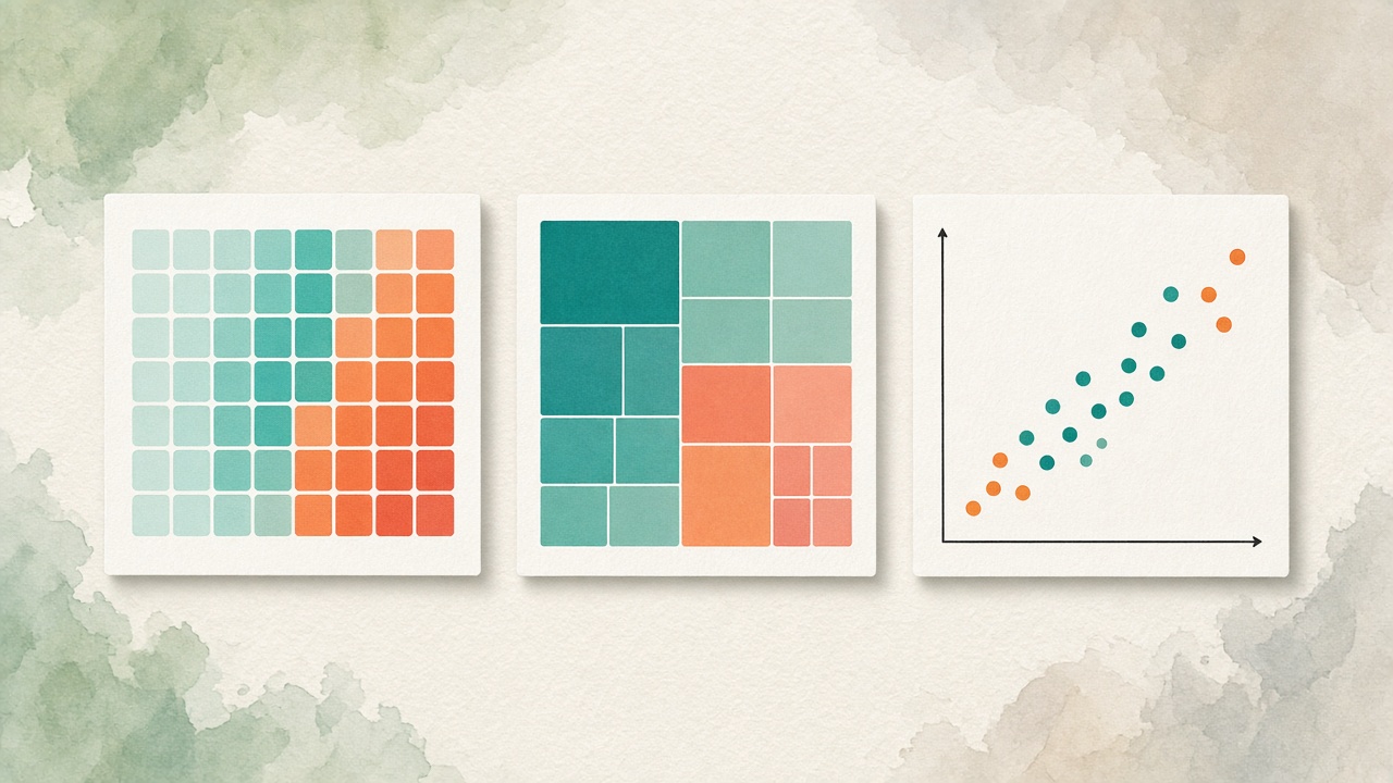
Part of our chart selection series. Start with How to Choose the Right Chart for Your Data if you want the full decision framework.
Once you know when to reach for a bar, line, or donut, the next step is learning the charts that answer harder questions: Where is intensity concentrated? How do nested categories share a total? Do two metrics move together?
Heatmaps, treemaps, and scatter plots are often treated as “advanced” — which usually means people either avoid them or use them as decoration. This guide treats them as tools with clear jobs. Match the job, and they become the most readable option on the page.
One Quick Filter Before You Choose
Finish this sentence: “I need my audience to see ___.”
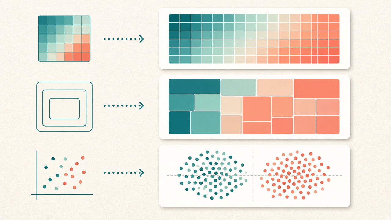
- Intensity across two dimensions → heatmap
- How nested parts make up a whole → treemap
- How two numeric variables relate → scatter
Rule of thumb: If the answer is “which category is biggest?” or “what happened over time?”, stay with bars or lines. These three charts earn their place only when pattern, structure, or correlation matters more than a simple ranking.
Heatmap — See Intensity Across Two Axes
A heatmap encodes a third value as color on a grid. Rows and columns are categories (or ordered bins); cell color shows magnitude. The eye scans for hotspots, cold spots, and gradients — not for exact decimals.
Use a heatmap when
- You have two categorical or binned dimensions and one continuous metric (hour × day of week → traffic; product × region → margin; feature × cohort → adoption).
- The story is about where intensity concentrates, not precise pairwise comparison.
- You need a compact overview of a matrix that would be painful as dozens of small bar charts.
Avoid a heatmap when
- Your audience must read exact values — pair with a table, or switch to bars for a filtered slice.
- Color scales are unbounded or poorly labeled (no legend, diverging scale used for sequential data).
- You only have one dimension. A single-variable “heatmap” is usually a bar chart in fancy clothing.
Design tips: Prefer a sequential color scale for magnitude (light → dark). Use diverging scales only when zero or a midpoint is meaningful. Sort rows and columns by a meaningful order (time, size, alphabetical) so patterns are not accidental. Cap category counts — a 40×40 grid is rarely readable on a laptop.
Treemap — Show Hierarchical Composition
A treemap divides a rectangle into nested blocks sized by value. Parent regions represent higher-level categories; child blocks show the breakdown. It answers: How is this total composed, and which nested pieces dominate?
Use a treemap when
- Data is hierarchical (company → division → product; budget → department → line item; storage → folder → file type).
- Space is limited and you need a share-of-total view with more than a handful of segments.
- Relative area matters more than precise ranking of every leaf node.
Avoid a treemap when
- Values are close — thin rectangles become hard to compare; use a ranked bar chart instead.
- The hierarchy is mostly flat (one level). A simple bar or donut is clearer.
- You need trends over time. Treemaps are snapshots; animate or facet them carefully, or use stacked bars / small multiples.
Design tips: Limit nesting depth (two levels is often enough). Label large blocks; let hover or a side panel handle the long tail. Color by parent category for structure, or by a second metric for enrichment — not both at once. Never use a treemap for time series.
Scatter Plot — Reveal Relationships
Scatter plots place two continuous variables on the X and Y axes. Each point is an observation. Clusters, slopes, and outliers emerge without forcing a single summary statistic. Add size or color only when a third variable clarifies the story.
Use a scatter when
- Both axes are numeric (spend vs. conversion, age vs. risk score, latency vs. throughput).
- You care about correlation, clusters, or outliers — not just averages.
- You want to check assumptions before fitting a model or drawing a trend line.
Avoid a scatter when
- One axis is categorical. That is almost always a bar (or strip) chart.
- You have too few points to see structure (e.g., five rows) — a table or bar is honest.
- Overplotting hides density. Switch to transparency, jitter, hexbin, or a heatmap of binned counts.
Design tips: Start axes thoughtfully — zero is not always required for continuous metrics, but truncated ranges need a clear reason. Label notable outliers. If you add a trend line, say whether it is linear or local, and never treat correlation as causation in the caption.
Side-by-Side Decision Table
| Question | Choose | Skip if… |
|---|---|---|
| Where is intensity concentrated across two dimensions? | Heatmap | Exact numbers matter more than pattern |
| How do nested categories share a total? | Treemap | Values are nearly equal or hierarchy is flat |
| Do two metrics move together? Where are outliers? | Scatter | An axis is categorical or points are too few |
| Which category ranks highest? | Bar / column | — |
| How did a metric change over time? | Line | — |
Common Mix-Ups (And Better Swaps)
- Scatter used as a timeline. If X is date and you care about the path of one series, use a line. Scatter is for many independent observations.
- Treemap used as a leaderboard. Ranking belongs on a sorted bar chart. Treemaps communicate composition, not precise order.
- Heatmap used as a calendar decoration. A contribution calendar only works when the audience already understands the scale. For executive dashboards, start with a simple weekly bar.
- Bubble scatter with too many encodings. Size + color + shape + labels turns a relationship chart into noise. Pick one extra channel.
Put Them to Work on Real Data
The fastest way to internalize these rules is to try two forms on the same question. Import a matrix and toggle between heatmap and grouped bars. Load a nested budget and compare treemap vs. stacked bars. Plot two KPIs as scatter and as dual-axis lines — then keep the one a colleague understands in under five seconds.
Tools with a broad chart library — such as VantaViz — make that experiment cheap: swap chart types without rebuilding the analysis, and keep sensitive files local while you do it.
Bars and lines will still do most of the work. Heatmaps, treemaps, and scatters are how you answer the questions those charts cannot.
Try heatmap, treemap, and scatter on your data
Import CSV, Excel, or JSON in VantaViz and explore 30+ chart types — processed locally on your device.
Get Started Free