Most bad charts are not design problems. They are data problems wearing a polished coat of paint.
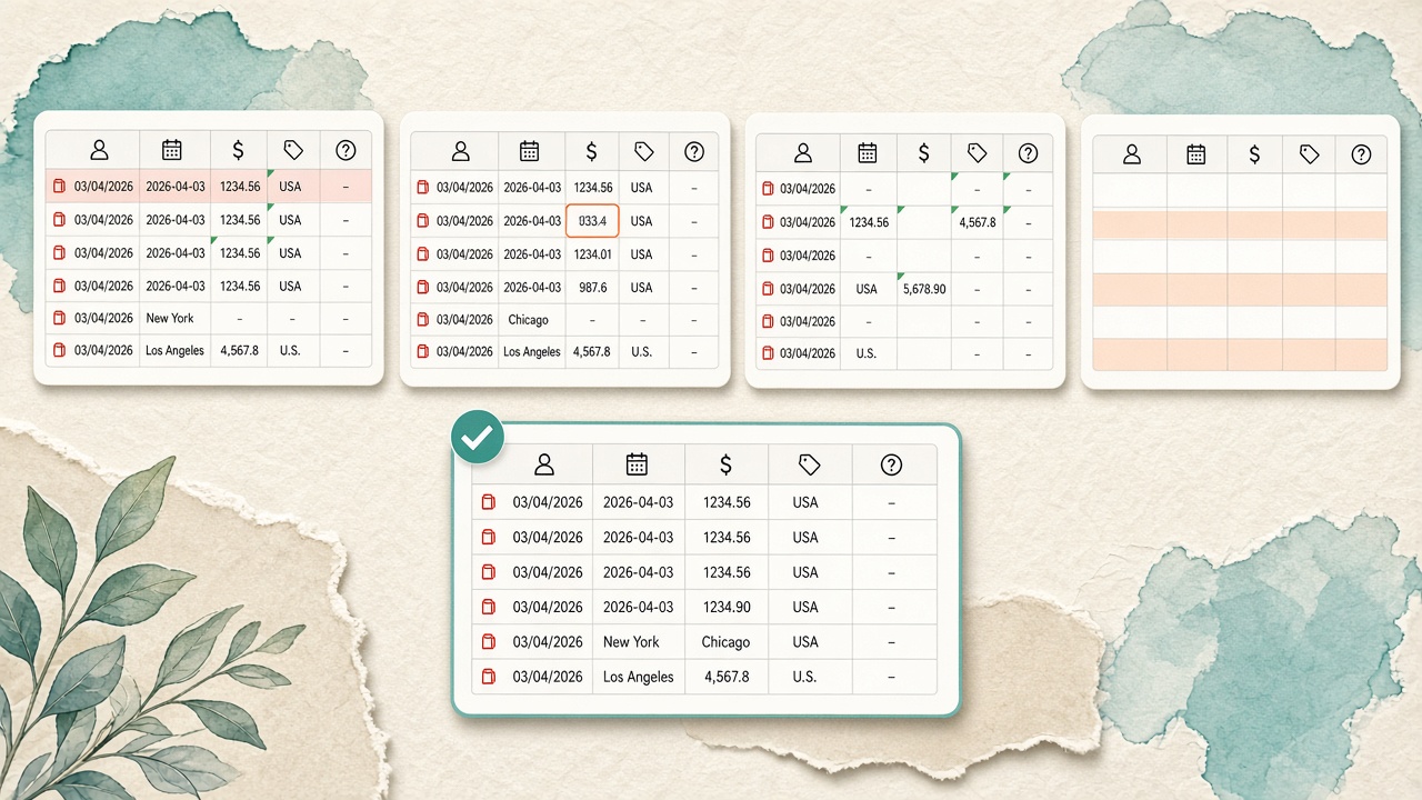
You export a CSV from a CRM, drop it into a visualization tool, and get a line chart that shows revenue falling off a cliff in March. The executive team panics. Then someone notices that March dates were stored as 03/04/2026 in one row and 2026-04-03 in another — and half the month sorted into April. The chart was technically correct. The data was not.
Cleaning data is the unglamorous step between "I have a file" and "I have an insight." Skip it, and every chart downstream inherits the mess. Do it well, and even a simple bar chart becomes trustworthy.
The 10-Minute Inspection
Before you change a single cell, scan the file like a reviewer, not an analyst. Open it, scroll, and answer five questions:
- Does every column have one job? A column named "Notes" that sometimes holds a dollar amount is a column with two jobs — and zero reliability.
- Are headers on row 1? Exports from ERP systems often include title rows, blank lines, or merged cells above the real header.
- Do numbers look like text? Left-aligned numbers, green corner triangles in Excel, or values like
$1,200.00and1200mixed together are red flags. - Are categories consistent? "USA," "U.S.," "United States," and "US" are four countries in a chart and one country in reality.
- Are dates actually dates? Mixed formats, timezone offsets, and Excel serial numbers (e.g.,
45292) break time-series charts silently.
Rule of thumb: If you cannot explain what each column measures in one sentence, do not chart it yet.
Fix the Problems That Break Charts
1. Strip and Standardize Headers
Rename cryptic export columns (col_7, AMT_USD_TTL) to plain language (total_amount_usd). Remove leading/trailing spaces — " Revenue " and "Revenue" are different fields to most tools. Use snake_case or camelCase consistently; avoid special characters that parsers treat as delimiters.
2. Convert Data Types Deliberately
Numbers stored as text will sort alphabetically: 9, 10, 11 becomes 10, 11, 9. Dates stored as text will not sort chronologically at all. In Excel, use Text to Columns or set explicit number/date formats. In code, parse with a defined format rather than hoping the locale guess is right.
3. Normalize Categories
Build a small reference map for dimensions you will group by: country codes, product SKUs, department names. A five-minute find-and-replace saves a chart that shows "Engineering" and "Eng" as separate bars. For open-ended text (job titles, city names), consider trimming, lowercasing, or fuzzy matching — but document what you changed.
4. Handle Missing Values With Intent
Blank is not always "zero." A missing survey response is different from a zero score. A null sales figure for a day the store was closed is different from a day with no sales. Decide per column:
- Leave blank — when absence is meaningful and your tool handles nulls
- Fill with zero — only when blank truly means none (e.g., optional add-on revenue)
- Exclude the row — when incomplete records would distort aggregates
- Impute carefully — for analysis, not for charts shown to executives without disclosure
5. Deduplicate With a Key
Duplicate rows inflate totals and flatten averages. Define what makes a row unique — order ID, user ID + date, transaction hash — and remove exact duplicates. Near-duplicates (same customer, two spellings, same day) need judgment: merge, flag, or keep separate depending on the question.
6. Validate Totals and Ranges
Sanity checks catch errors that formatting misses:
- Do monthly parts sum to the annual total?
- Are percentages between 0 and 100 (or 0 and 1)?
- Are there negative quantities where negatives should not exist?
- Do date ranges overlap impossibly (end before start)?
One failed check is worth ten minutes of chart tweaking.
Common Mess Patterns (And Quick Fixes)
| What you see | What broke | Quick fix |
|---|---|---|
| Flat line with one spike | Single outlier or unit mismatch (cents vs dollars) | Sort by value; divide or multiply to one unit |
| Too many tiny categories | High-cardinality dimension (SKU, user ID) | Group into top-N + "Other," or filter |
| Time axis out of order | Dates parsed as text or mixed formats | Parse to ISO 8601 (YYYY-MM-DD) |
| Double-counted revenue | Duplicate rows or joined tables | Deduplicate on transaction ID before aggregating |
| Chart shows "null" labels | Empty category cells | Replace with "Unknown" or filter nulls out |
A Minimal Workflow You Can Reuse
You do not need a data engineering team for everyday files. This sequence works for most CSV and Excel exports:
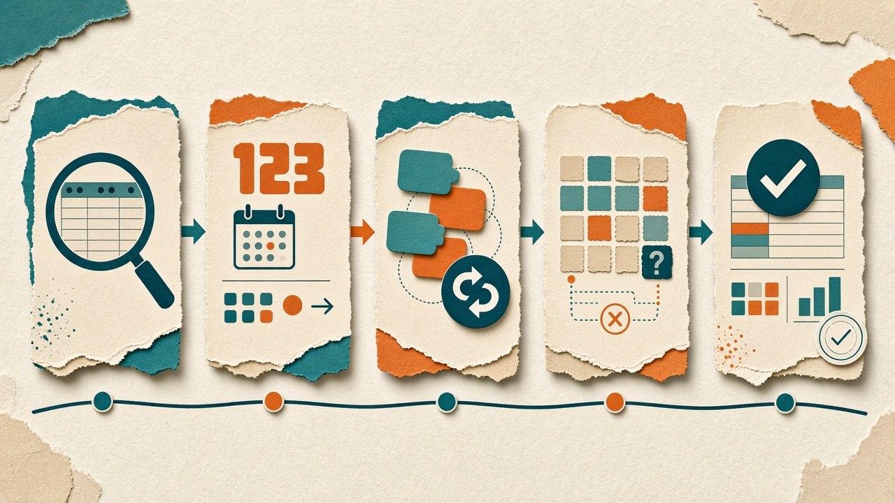
- Import — keep a raw copy untouched; work on a copy
- Inspect — row count, column types, sample of unique values per column
- Transform — headers, types, categories, nulls, dedup
- Validate — totals, ranges, spot-check against source system
- Visualize — now pick the chart that matches your question
That last step is where guides like How to Choose the Right Chart for Your Data pay off — because the chart choice assumes the numbers mean what you think they mean.
When "Good Enough" Is Good Enough
Not every exploratory chart needs publication-grade cleaning. If you are scanning a file for the first time, a rough chart on slightly dirty data can reveal where to clean: which column has the bad dates, which region codes are inconsistent. The mistake is presenting that draft chart as a decision — or skipping cleaning entirely because the preview "looked fine."
Draw the line at audience and stakes. Internal scratch work can be messy. A board slide, a client report, or a metric that triggers spending should pass the inspection checklist every time.
Clean Data, Clear Charts
Visualization tools make it effortless to turn rows into bars and lines. That speed is a gift and a trap: the chart renders before you have asked whether the rows deserve to be counted. Spend ten minutes cleaning first, and the chart you build next will not just look right — it will be right.
Ready to visualize clean data?
Import CSV, Excel, or JSON into VantaViz and explore your dataset locally — no upload required.
Get Started Free