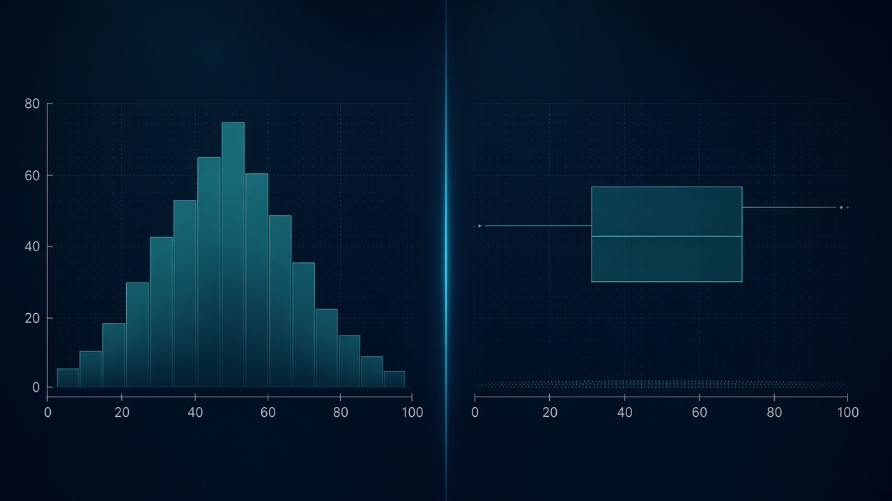
Part of our chart selection series. See also How to Choose the Right Chart for Your Data and How to Clean Messy Data Before You Chart It.
Histograms and box plots are the default answer when someone asks, “What does this column look like?” Both are compact. Both feel objective. And both can tell a story that the underlying data does not support — not because the math is wrong, but because the chart makes choices your audience never sees.
This is not an argument against either chart. It is a field guide to the moments each one quietly misleads you, and what to do instead.
What Each Chart Actually Promises
A histogram groups values into bins and shows frequency (or density) as bar height. It promises shape: peaks, gaps, skew, and — if you are lucky — multiple modes.
A box plot (box-and-whisker) summarizes five numbers: minimum, first quartile, median, third quartile, and maximum — with “maximum” and “minimum” often defined by a whisker rule rather than the raw extremes. It promises location and spread: where the middle sits, how wide the bulk is, and whether anything looks unusual.
The core tension: Histograms show too much detail in a fragile way. Box plots show too little detail in a confident way. That is exactly why both can lie.
When Histograms Lie to You
1. Bin width rewrites the story
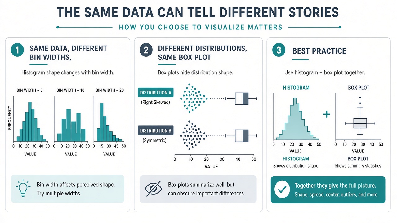
Histograms are not pictures of your data. They are pictures of your data after you sliced it. Wide bins smooth away peaks; narrow bins invent spikes from noise. Two analysts can plot the same CSV and one sees a clean bell curve while the other sees a suspicious double hump.
Fix: Try two or three reasonable bin widths and keep the axis range fixed. Better: use a density curve or a rug plot alongside the histogram so the raw points stay visible. If the conclusion changes when you change bins, the conclusion was never solid.
2. Small samples look orderly
With 30 rows, a histogram can look like a meaningful shape when it is mostly random stacking. Bars jump up and down; the audience reads pattern anyway.
Fix: Always show n in the title or subtitle. Below roughly 50–100 points, prefer strip plots, beeswarm plots, or a simple dot plot. If you must histogram small data, use fewer, wider bins and say explicitly that the sample is small.
3. Comparing groups on different scales
Overlaying two histograms with different sample sizes, or different x-axis ranges, invites false conclusions. A taller bar might mean more observations, not a higher density.
Fix: Normalize to density (area sums to 1), align axes, and use transparency. For two groups, side-by-side box plots or overlaid density curves are often clearer than dual histograms.
4. Gaps that are really rounding artifacts
Salary data stored as integers, latency reported in whole milliseconds, ratings on a 1–5 scale — histograms turn discrete steps into dramatic valleys. The chart shows a “gap” where the measurement grid is the real cause.
Fix: Check whether the variable is continuous or discrete before choosing bin width. For discrete data, a bar chart of value counts is often more honest than a pseudo-continuous histogram.
When Box Plots Lie to You
1. Identical boxes, completely different shapes
This is the classic trap. Two distributions can share the same median and quartiles yet differ wildly — one symmetric, one bimodal, one with a long tail on only one side. The box plot looks the same; the stories are not.
Fix: Pair every box plot with a jittered strip plot, a violin plot, or at least a histogram of the same group. If you only show one summary graphic in a high-stakes deck, make it the one that preserves shape.
2. Bimodality disappears
Box plots summarize position, not structure. A dataset with two clusters around 20 and 80 can produce a median near 50 and a box that suggests a single central bulk. Your audience walks away thinking “typical value is middle of the range” — which almost nobody actually has.
Fix: When you suspect segmentation (customers, devices, regions), split the chart before summarizing. A box plot of blended populations is a summary of a mixture, not a type specimen.
3. Whisker rules nobody agrees on
Software differs. One tool draws whiskers to 1.5× IQR; another marks outliers as points; another extends to min/max. Two box plots from two tools can look like different datasets.
Fix: Document the rule in a footnote: “Whiskers extend to 1.5× IQR; points beyond are outliers.” Better: show all points with transparency and treat the box as annotation, not the whole story.
4. Hiding sample size again
A box plot of three points looks as authoritative as a box plot of three thousand. The geometry does not change; the reliability absolutely does.
Fix: Add n under each category label, or scale box width proportionally to sample size if your tool supports it. Never rank groups by box-plot visuals alone when n differs by an order of magnitude.
5. Too many boxes in one row
Twelve box plots across a slide compress into a fence of identical rectangles. Differences in IQR become unreadable; outliers overlap. The chart implies rigorous comparison while delivering guesswork.
Fix: Filter to the comparisons that matter, use faceted small multiples vertically, or switch to a sorted dot plot of medians with error bars for the specific question you are answering.
Same Question, Different Honest Answers
| Your question | Start with | Watch for |
|---|---|---|
| What is the overall shape — skew, peaks, gaps? | Histogram (or density curve) | Bin width, small n, discrete data |
| What is typical, and how spread out is the middle 50%? | Box plot | Hidden bimodality, whisker rules |
| Compare distributions across groups | Side-by-side box plots + strip overlay | Unequal n, too many categories |
| Are there outliers I should investigate? | Box plot with points shown | Outlier rule hiding real second clusters |
| Present to executives in one slide | Box plot for range + annotated histogram inset | Either chart alone oversimplifying |
The Workflow That Stops Both Charts from Lying
- State n first. If the sample is tiny, downgrade the chart type before you polish colors.
- Plot the raw points when you can. Overlaid dots cost little and prevent silent surprises.
- Stress-test bin choices. Change bin width once. If the headline changes, lead with caution — or show multiple panels.
- Match chart to decision. Shape questions need histograms. Threshold and comparison questions need box plots. Most analytical conversations need both.
- Clean the column first. Nulls, mixed text types, and duplicate rows distort both charts equally. Fix the table before you trust either summary.
Quick Red Flags in Review Meetings
- A histogram with no axis label saying whether bars are counts or density.
- A box plot comparing groups without n on each label.
- A “normal-looking” histogram built from fewer than 40 observations.
- Outliers marked on a box plot, but no investigation of whether they are a second population.
- Two histograms on different x-axis ranges presented as a before/after story.
None of these are always wrong. They are moments to pause and ask what the chart is smoothing away.
Try Both on the Same Column
The fastest way to build intuition is to toggle. Plot a histogram, then a box plot, then overlay points on the box plot — same filtered column, same axis limits. If the stories align, you can simplify for the final slide. If they diverge, you have learned something before the meeting, not during it.
Tools with flexible chart switching — such as VantaViz — make that iteration cheap: import CSV or Excel, chart locally on your device, and compare forms without rebuilding the dataset each time.
Histograms and box plots are not rivals. They are complementary summaries — each dangerous when used alone, each reliable when you know what they compress out of view.
Compare histogram and box plot on your data
Import CSV, Excel, or JSON in VantaViz and explore distributions with 30+ chart types — processed locally on your device.
Get Started Free